Project Overview
Giving a familiar app a fresh start
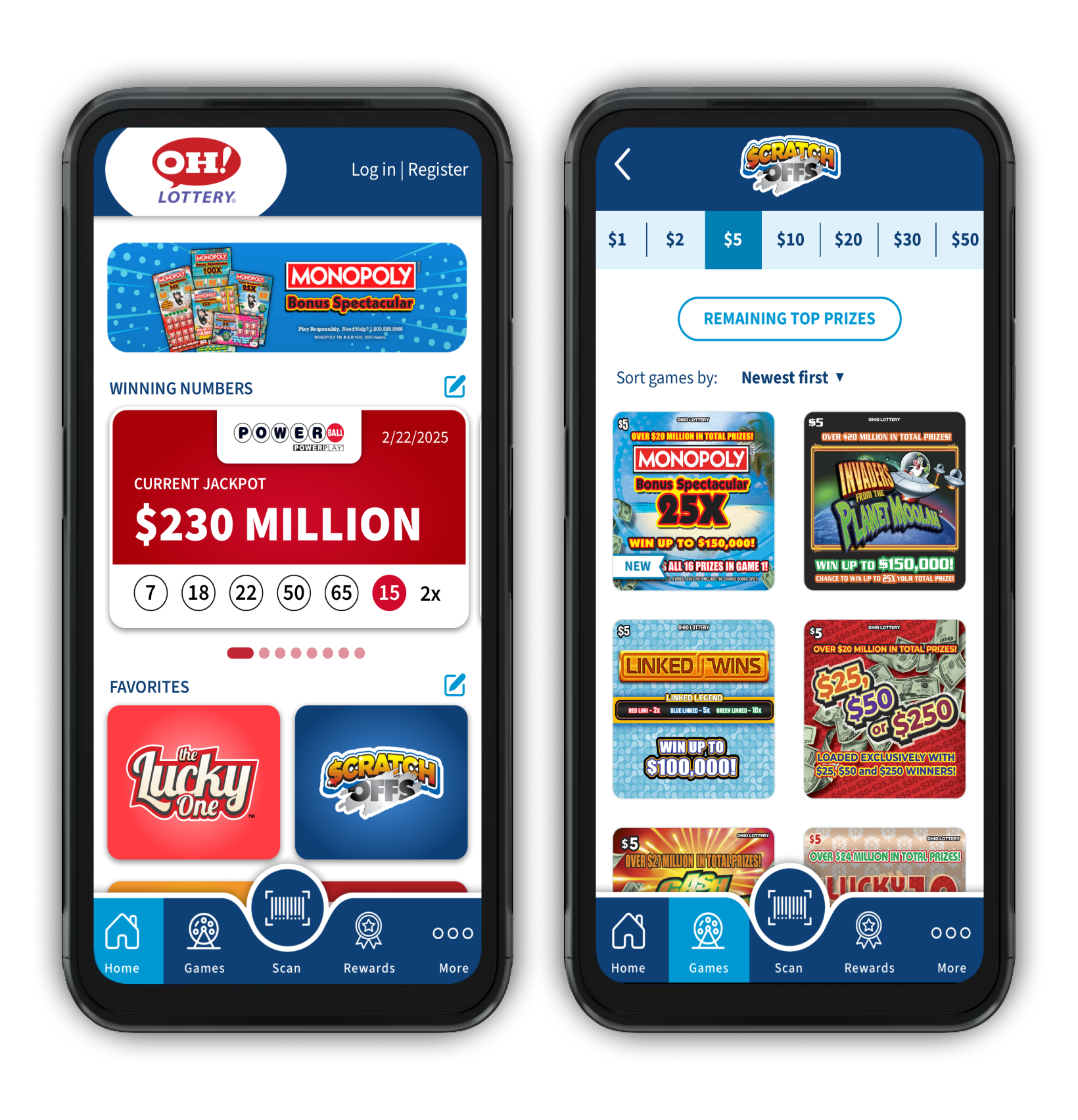
The Ohio Lottery’s app already had everything players needed — it just needed a better way to bring it all together. Rather than starting from scratch, I focused on giving the familiar experience a thoughtful refresh: reorganizing content, simplifying navigation, and creating a more dynamic interface that made the app easier and more inviting to explore. From early information architecture and layout exploration through final UI and prototyping, I helped shape a refreshed experience that felt new without losing what made the app familiar.
Discovery
Understanding what the app needed
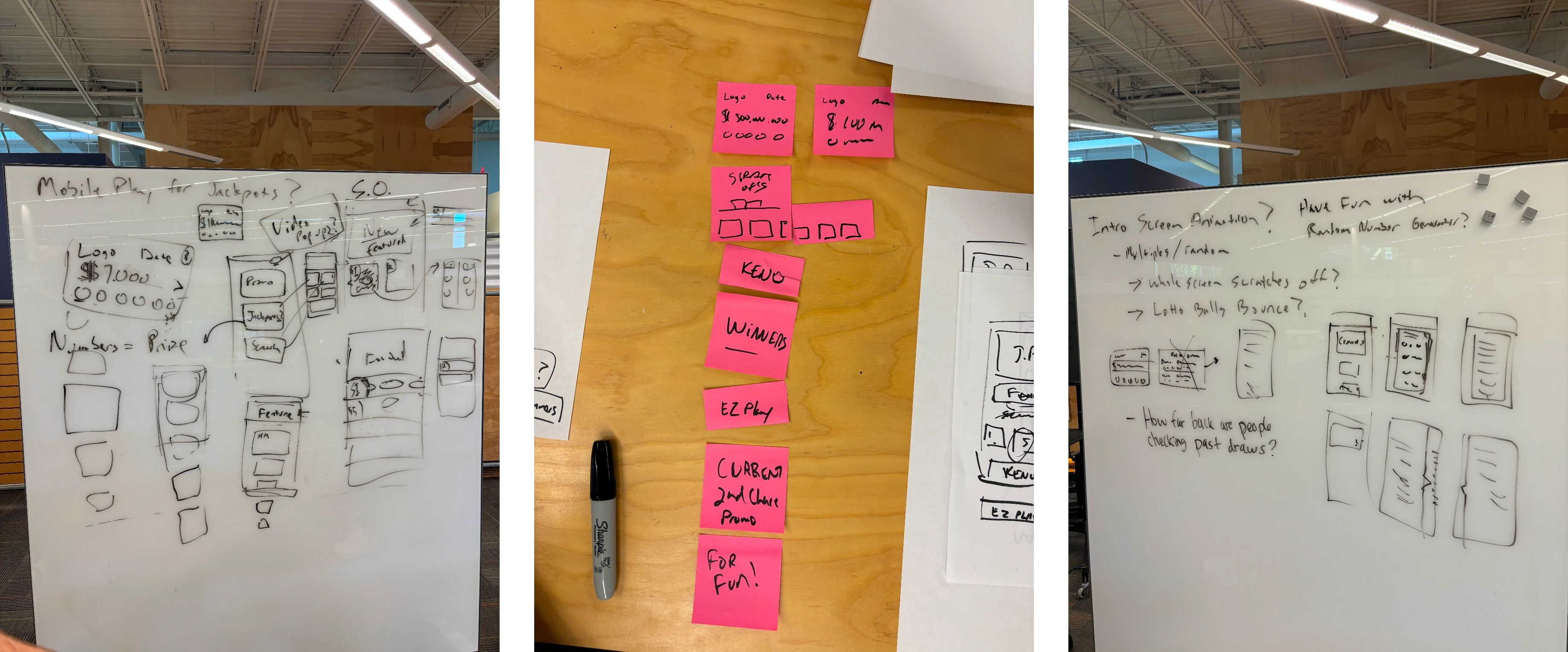
Before touching the interface, I worked through the existing experience to understand what information it needed to support and how it could be organized more intuitively — focusing on how content, navigation, and screen layout could work together.
My focus: Information architecture and early screen-layout exploration, working from existing app data and user pain points.
User Flow
Mapping the experience
Once the content and features were clearer, I translated that thinking into the actual experience — mapping how users move through the app and how different pieces of content support each other. This established a clear hierarchy before any detailed screen design began, giving the team a framework to build from as the interface evolved.
Iteration
Designing in phases
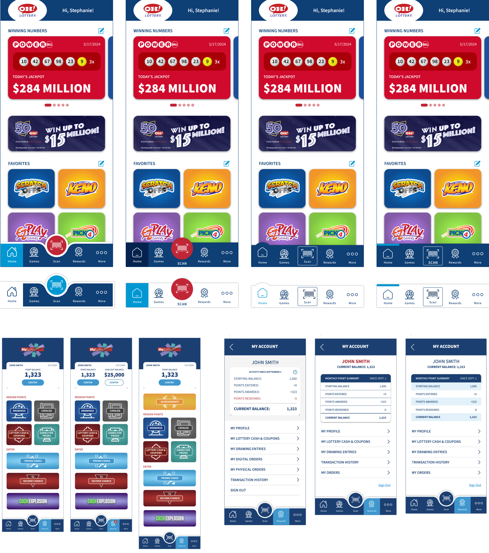
Visual exploration tested different ways to balance the volume of content against a more dynamic mobile experience. The redesign moved through multiple rounds of feedback — I explored several layouts and visual directions before narrowing in on a system that gave the app more personality while keeping navigation and key actions easy to find.
Design Systems
From structure to final UI
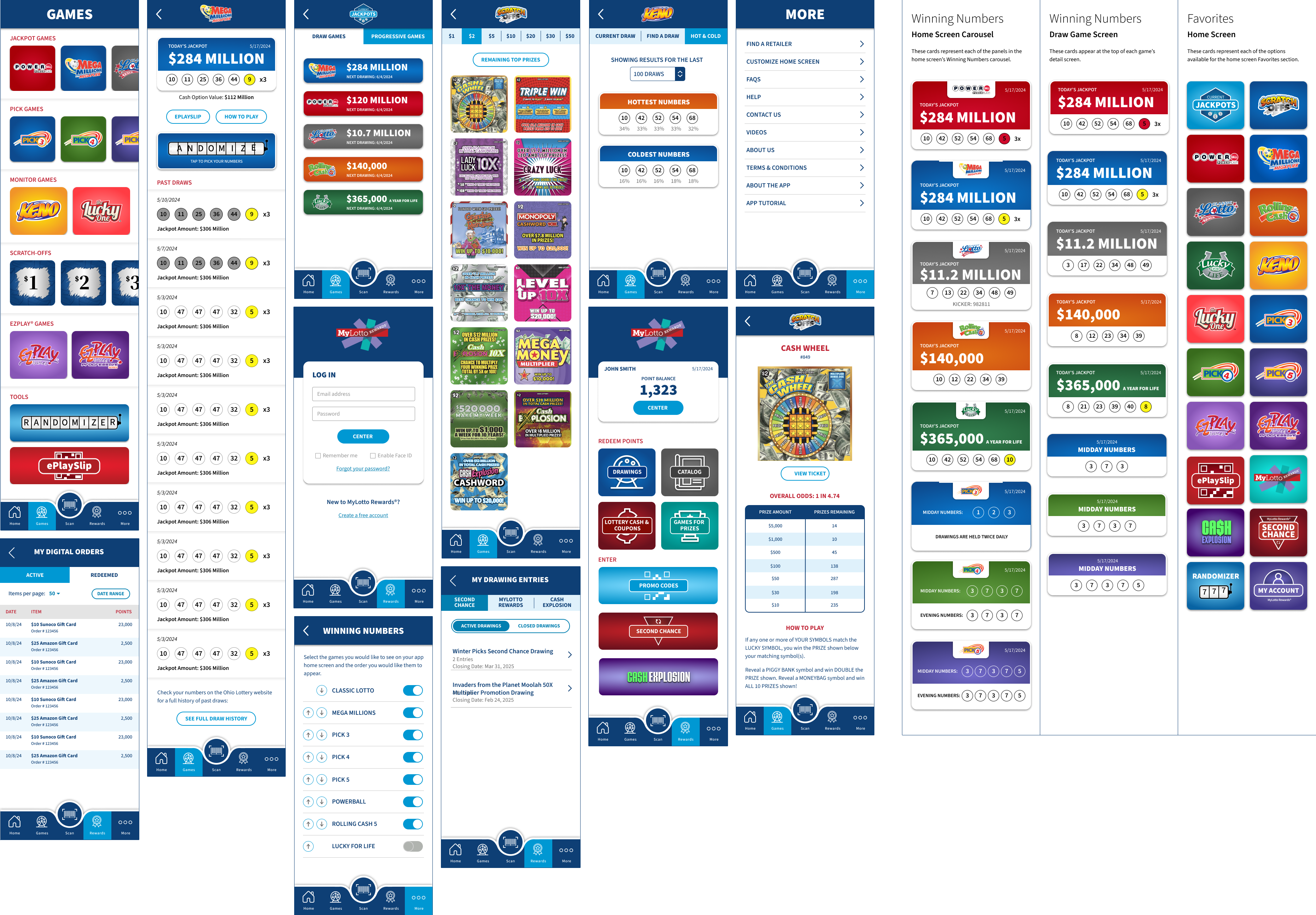
With structure and direction established, I refined the interface across the app, focused on consistency, hierarchy, and a more engaging visual experience. Reusable patterns and components created a cohesive feel across screens while leaving room for different content types and interactions.
Outcome
Designing for engagement
The redesign was designed to give users more reasons to interact. Following the refresh, the app saw a nearly 2% increase in engagement rate, while average engagement time per session increased by 32%.
Overall engagement time per user also increased by 18.5% compared to the previous experience. The numbers suggest that the redesign wasn't simply a visual change — it helped create an experience where users spent more time actively interacting with the app.